matplotlibでx軸を共有するグラフを作ったときに、左右どっちの軸を参照しているかわかるようにbarと同じ色をつけたくて調べたので、以下にまとめる。
import random
from typing import List, Tuple

import matplotlib.pyplot as plt

if __name__ == "__main__":
    # generate 0~999 integer x 30
    data = [random.randint(0, 1000) for _ in range(30)]

    # separate by 100
    heights: Tuple[List[int], List[int]] = ([], [])
    names: List[str] = []
    for idx, d in enumerate(sorted(data, key=lambda x: -x)):
        names.append(str(idx))
        if d >= 100:
            heights[0].append(d)
            heights[1].append(0)
        else:
            heights[0].append(0)
            heights[1].append(d)

    fig, ax = plt.subplots(figsize=(10, 4))

    color_left = "royalblue"
    color_right = "orange"
    holder = list(range(len(data)))

    ax.bar(x=holder, height=heights[0], color=color_left)
    ax.set_title("Sample")
    ax.set_xticks(holder)
    ax.set_xticklabels(names, rotation=90)

    # create new axis that share x-axis with ax
    ax2 = ax.twinx()
    ax2.bar(x=holder, height=heights[1], color=color_right)

    # change ytick color
    ax.tick_params(axis="y", colors=color_left)
    ax2.tick_params(axis="y", colors=color_right)

    fig.savefig("sample.png", bbox_inches="tight", pad_inches=0.05)
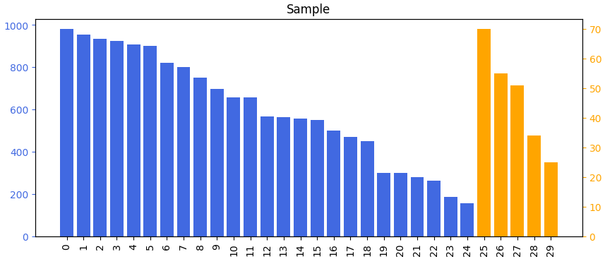
これで次のような画像が生成される。(random.randintしてるので出てくる画像は非決定的。)